31.3.09

Play


vector imagery is something i have come new to this year with the dawning of computers to myself in graphic design this year, after previously being scared going anywhere near them incase i became an addict to which i had become for the project on dust. moving on however i found some really nice vector line work which could be a great starting point to what is a line, these were produced by a designer called pablo alfieri. They are incredibly beautiful and intricate yet although i admire their brilliance i would appreciate them far more if i could see some hand drawn work to give it some personality and depth. The colouring s also beautiful and well selected. here are a few images of inspiration. follwing this i also came across a similar illustrator who uses vector imagery in her work Nancy Veltri's illustrations are really simple and a aesthetically pleasing which are indeed simple to make and construct. none the less however a simple and less intricate way of working, a definite contrast in styles here.
on the idea of looking at artists i took the time to look back at sara fanelli whos work many people have stumbled arcoss and taken on in their own styles. i love craft. especially looking this kind of design by fanelli, the way she plays and works with old material and collaging it over and playing with material it is a fascinating and carefulselection and layering that achieves such brilliant visuals. i like the application of line in her work whichi is what our subject entails. craft would definetly be something to consider later on and in the mean time i would like to start drawing lines and familiarise myself with the selection and application of line.

More


also looking at new artists i came across a few cool ones which will hopefully help me into getting into that idea or drawing line and crafting in particlular. David Sparshott which i discovered is an amazing illustrator and designer his simple use of line integrated with use of playful collage and imagery make fantastic imagery. i love the illustration he produced over looking Bristol looking at the architecture and mixed with this simple use of black line. its really intriguing his work and i feel this kind of style and way of work could be quite simple to produce i just need to get the content and message of what i am trying to communicate across. it would be quite interesting to look at creating imagery from the pictures that i took from Paris as the streets around Paris are incredibly organized and would produce probably clearer drawing and show important places of interest or place i stayed in within a long time.
Looking on the idea of illustration again i looked at Oliver Jeffers whom i have come familiar with looking over the recognition brief but a style of which it very relevant to my ventures into the line project. his beautiful style of working reflects less about the line as he integrates watercolour into his work, instead of the piece of material like David Sparshott. i do like this way of working and even though i cannot create good water colour imagery i am good to hand with some inks and my favourite Berol pens which given practically the same effect except its just not water colour. i should hope to purchase some water colour pencils over the Easter holidays instead of eggs which is a shame, but good at the same time.

Angles

i almost forgot that i looked at this in a gallery whist in paris. how could i possibly forget it, it was truly amazing. in the paris museum of modern art which was a truly amazing building i came across this piece designed by 'Agam' presumably a design company of sorts, this piece was a commission for the frech president Georges Pompidou as a homage in the memory.
Agam's kinetic interior for the design of the elsee palce was commissioned by the president in 1971 and was to be designed as a pictoral space on which the scale of a room, exploiting walls, ceiling, floors and doors and folows the design principles of the artists ideas of polymorphic painting in its use of coloured prism shapes to create abstract compstitions that change with the point of view, installed between 1972 and 1974 inder the guidance of the Mobilier Nationale ( the state collection of furniture and tapesries). it was finally disassembled in 2000 and presented to the centre Pompidou. it draws on a very precise set of colours and materials, which offer a vision of dynamic, geometic space , suggesting a permenant metamorphosis of the visual world.
this piece was really amazing to view and from different angles i could clearly see line being composed in different angle and points. the colour of this piece was also quite amazing how it changed throught the different colours of glass and highlighting different areas of interest within the drawing of the lines. i really like the idea of perspective and it would have been better if i was able to walk around the room and properly view the piece up close and personal and interact with it. The mirror in the middle of the room was also quite amazing as the chrome reflected the lines of colour even further creating a distortion in the middle of the room. this provided me with something to think about on the subject of line by looking at an investigation into the idea of lines not on a canvas but virtual and subjective manner.

30.3.09

On the Subject


on the subject of line i have come across some imagery to do with line which i think could help move the process of making visuals a lot easier. here are a couple of examples. i think the most important thing which i need to consider is the element of craft which is essential i think to the visual side of things. having set myself 3 rules the first being 'to maniulate craft and only utilise digital technology to create collage or adjust imagery, not create it.' i think it is essential that i stick to this rule and in so doing i have come across a number of artists and designers who use craft within their work.
i really like the work produced using pen by jess wilson which with her use of bright almost synthetic colour reflects a kind of craftsmanship i could like to create. utilising a handdrawn style with digital colouring. This a type face she develpoed and i love it, i dont know if it would be readable but in use in short words i think this could look really attractive. on a small scale is something i think we share in common with her delicate attention to detail in her drawings.
i also came across luke best through looking at chloes blog and again its a simple styling imagery combined with colour that achieves such a brilliant imagery. as of yet i havn't limited myself to a colour pallet which could greatly help in what i want to achieve. he has also experimented across media type where he produces tattoos from imagery that he creates. some very exciting work and i think if i were to have a tattoo it woul look something like this and possibly be a bird of some kind

On Line


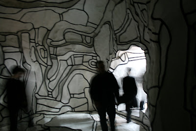
whist in paris i came across an exhibition piece which excited me greatly, based on an idea of a cave an artist has created an installation piece in the modern paris gallery. its was amazing its like you are wandering into a stripped down version of a cave, no colour, no texture just simple vector imagery running throughout the cave almost as if it were constructed from paper of was on a topographical map. it felt clean and santitised not like a real cave which would be damp, cold and rough and yet you almost felt like you were in a real cave witht the structure of the cave making elegant shadows in the darkness as you embark into the cave. fascinating truly. The piece was done by an artist, Jean Duhuffet, 'le jardin d'hiver' it was called (i love the french language by the way its so sexy and brilliant and just has a flow about it i could listen to for hours.) The construction of this jubilantly, enigmatic jigsaw construction started in 1962 and the circumvoluted line and areas of sombre colour that make the cave , or canvas, dance with life. it has been described as a garden that has no greenery but shares greatly the resembelance of a grotto or cave withsimple black lines to emphasize the structural parts. The construction is complex with the walls and floor taking a bumpy and uneven effect which is underscored by the simplicity of the white and black. overall this piece insired me greatly and showed the nature of line as a 3d piece and less like it had to drawn onto a piece of paper. i looked more at imagery of the parisian streets from this, the maps and the structure of architecture for inspiration into lines.
after looking briefly at dot to dot i thought that the first thing that i should do should be to actually produce one, a sample if you will to help start the process off a bit and what more of a starting point is better than looking at something on a huge scale. looking at the concept of dot to dot i took an images and enlarged it massively to over an a2 size and from there i started drawing a dot to dot taking a massive 900 dots in total. a pretty magnificent feat if you will for a starting point into this idea of line. potential lines if you will. i really like how from a distance the dots actually merge to produce line which is quite fascinating maybe this could become a play on idea looking singular point which from a distance or agle produce line. possibly like the work done for the channel 4 advertisements where the parts making up the channel 4 logo join up to produce an image of the logo at certain angles. maybe this could be an idea to play on and how points can incidently produce line, maybe optical illusions could be quite fascinating. anyways here are a few images of the dot to dot that i produce taking a massive 5 hours to complete and i think if i were to do this again i would definetly work on a smaller scale.
aside from producing a dot to dot as astarting point i felt it necessary to get some useful primary research and what better use of line than the neubauwelt book. it does indeed fascinate me. after seeing fred hold one up in colllege it was indeed one of those implusive buys that you just have to have, a collectors item, just looking through you become mesmerised at the exquisiteness of some of these illustrations and it makes you want to view more and more. the book also comes with a cd which i havn't sample yet but i contains a sample of illustrations taken from the book which you can use yourself. The simple vector based imagery of this book is truly fascinating, who would have thought such recognisability would be achievable through simple line and colour (which is gorgeous). taking on this idea of using line to create imagery ive had thoughts about creating imagery from these and interpreting this style in the form of dot to dot. how good would that be a simple book that could be used to pass the time by connecting dot on different drawings, definitly something that would go down well by the pool whilst on holiday. i would like to produce a couple of these to see where this takes me in the mean time i have couple of ideas to play on. see imagery of the book below aswell as some sample dot to dots which i created, see if you can recognise them and mentally join the dots.

Direction


so from the initial starting point looking at a way to document the objects people or places i have finally come across a good concept to which i can build upon. starting initially at the start back in November o had ideas of working with the play on idea of dot to dots. however to my dismay my colleagues disapproved of this ideas considering that i had no subject the idea of working with something in dot to dot had no context, what was it trying to achieve by using this kind of method to create lines? i needed a subject to work with it was great that i had targeted a specific area to work with but it lacked the content, i needed subject not styling at this point which would really help my exploration. i looked at several of these and even looked at a dot to dot tattoo which when assembling the dot differently produces different images. this could have been really interesting but i lacked the will power after getting shot down in the crit. maybe i could have worked with this idea a bit more creating subliminal imagery out of simple forms, this could have been really interesting and would have tackled what is a line on a direct manner. but i was everly put off thinking about what subject could be interesting.
from there i struggled to find a subject areas that would be compatible with the kind of styling i was trying to achieve. i slowly drifted and ran completely out of ideas and i had to simply start looking for a new way of interpreting what is a line? this initial confusion made me very hesitant to start looking again and because of the crit feedback i had received this did not help boost my confidence in achieving anything at all. from here the subject went very dry, having my elective also did not help the situation and so for about 2 months visual language was a thing t do on a Tuesday afternoon and not at any other point. i also feel strongly at this point that not enough importance was put onto the brief. to get fully emerged into what is a line i feel it would have helped greatly f i had a strong idea of what it is we we supposed to produce, examples of work would helpful, what subjects, media type any guidance would have been greatly received. were we to work on this project in a more direct manner actually utilising line instead of metaphorical lines? question questions questions? it seemed there was no guidance or rules.
mid-February and i had planned to visit Paris as a break from the stresses of graphic deign living. Paris is a beautiful place to visit and exciting to get away and not have to think about what work i had to finish, thankfully at this time i had finished the current module and i had also finished my elective in print which i had thoroughly enjoyed but not so much the assembly of the sketchbook or the impending deadline. Paris indeed was a fantastic and huge capital and consequently i ended up looking at the maps over and over again which did get confusing at times. the map of Paris that we received was a brilliant example of instructional and organised architecture and street plans. and from this i started looking at lines again inspired with the structure of the Parisian streets i produced examples of these and looked briefly at the rose line which was interesting in itself but very limited to what i could look at. i only ended up finding one of the Arago plates which was altogether disappointing.
from here emerged onto looking at my existence taking inspiration from Chloe's book based on her 100 ways of documenting her existence, the first step into looking forward to a concept that i think could be successful. i like the idea of doing something such as this which is personal to me not only because the information is about me be because the vast majority of information that is used comes directly from myself, like a library, but far easier to get exactly to get what your looking for. From looking at the book that Chloe produced it seemed clear to me that i would be requiring a nature a nature of craft to produce something that is so personal and beautiful.
having now established what it s i am trying to communcate then next stage will obviously to put the design into practioce. but i don't really have an idea of how to represent such large quantities of information or even what kind of scale can be achievable within the time that is available.

24.3.09

In Recognition

coming back from having a break we are getting stuck into work stright away. no pain no gain. and for this week the idea is about getting our work out there and into the environment to gain experience in the working environment of graphic design.
we had a choice initially to work on one of two briefs. The first was for the competition for the "Don't Panic" poster which are run every month publicly, most of us have heard of this brief before as the packs are very sought for in the college. the brief for this poster one was on the concept of 'pure' or 'purity' which stuck me with several ideas by taking it literally such as the ideas of simplicity in the for of bubble and the the idea of cleanliness and even looking at the idea of virginity could have been a possible start for this project which could have been really interesting. the second choice however was the concept of recognition and the idea of celebrating achievements. this was for a fairly new event called recognition day held on the 4th of may every year (cough* my birthday) so at this point i was getting very excited at the idea) and the brief was to produce and A6 image based on the concept which could be printed onto a postcard and would be posted to people in aid of recognition day. sounding very exciting i selected the recognition day brief because it was a special date for myself and also because it sounded morale boosting and a happy project to get on with. i also chose this brief because of how the don't panic poster brief is run every month and i suppose i could enter this competition at any time whereas i could only enter the recognition brief once a year. plus there is a higher prize at stake for the recognition brief, payment + a possible work placement in london, what more could one want?
so working on this idea of recognition i had a couple of ideas initially my main idea was about communnicating rememberance and the possible achievements of everyday life which is celebrated in death. gravestones, not the most obvious way to go and not really celebratory but none the less interesting and a way of celebrating lifes achievements when you are gone, again not really upbeat but something we must all come to realise at some point in our lives. so working onthis idea i took photographs and worked on this idea until the end of the week which ame tiresome but i think now looking back at the work that i produced it was a good direction but i think i could have produced better imagery in the end. here i have a few images which show the development through the project, i think i should have approached this project less heartedly and been far less serious on the idea maybe even produce a humorous spin in the whole thing, i think it would have made me in myself feel better about this project and made it more fun and more productive.