29.10.08

Sing a Rainbow Too

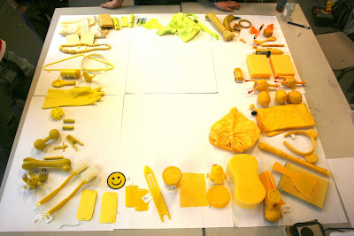
such a lovely day. i think this was one of the least pressured days of the course so far. simply colour arranging items all day was so much fun! Working on a specific colour, mine being yellow, we were split into our colour groups and told to discuss then arrange our coloured objects in values of colour, arranging them in different ways such as darkness, tone, hue, concentration etc 
we then discussed what coloured object best illustrated the colour of yellow, then compared and contrasted the tones of yellow then grouped them again. not all together that interesting but never the less an important study.
we then got into groups with our complimentary colour and compared and contrasted our colour to purple. at this point we thought it necessary to take an extended break... 
the day was interesting and i got some cool pictures of some very random objects.


25.10.08

Paper Planes

ah... hmv, a great place for music, games and dvds. and it proved it today. i found this amazing album by "Mia", it was playing in the store at the white rose centre and i had no idea what it was. so for the first time i asked a assistant and she told me what it was and found the album for me. it is beautiful by anyones standards i had no idea about this artist before but i took a gamble on such a beatiful piece of artwork. its a great album too. an absolute example about the power of graphic design.

The Brutality of Graphic Design

produce a set, series or sequence of 10 images that visually answer the question ‘WHAT IS….(your colour)?’. so we did.
after working rigorously all week we all had produced a series or set of images that represented what we thought of as our colour, it had come to the end of the week and we were told that we would be having a 'crit' or discussion if you will, about what we had produced. we were split into groups of complimentary colours i.e. yellow and purple etc and were were told too arrange our work on the walls so that it could be seen by everyone.
We were then told how this would work, we would discuss our opposing groups work separetly saying what was successful about each piece and what was not, dicussing it and looking at each piece and seeing if it showed, "What is.... (your colour)?" We were then told that we would have to decide which was most successful and which was not, comparing each one with all the others and arrange them in first and last place. i felt sickened and shocked.
my heart sank immedietly and as we began talking about each piece it felt wrong. the idea of comparing work in first or last place was disgusting. we all have no doubt been working extremly hard this week on the project trying to find an individual way of doing things and seriously complating about the colours that we were given. taking into account that this was the first real project that could involve more of a breadth in graphic design rather than just on the concept of type design, the pressure was on to produce something that for the first time really said something about not only our colour but about ourselves. as the crit progressed we were told that the work would be taken off the walls as we told our opposing group who came last and who came first starting obviously with the last. again this was so wrong. the ideas that were generated were all different and individual and showed an opinion which in my eyes, an opinion is an opinion not wrong or right. it was heart-rendering to see work that was amazingly good be torn down and discarded so brutally. these peoples work that we had to tare down from the wall we have known for just over a month, a month. we are still on a fresh basis with each other and sometimes might forget each others names, how gutting and almost nasty is it to force us against each other and say whose work is the worst. i couldn't bare to look at the persons work who we had jsut slated and given it a fourth, second or even a first place.
i realise that i myself may not have a strong personality on commenting honestly and realistically without feeling a certain reluctance about doing so. i understand graphic design is a competitive working area but to publicly say its good but not as good and 'sonesone's' work is a horrible honesty. i think there should be some subtlyty about comparing peoples work in such a sensitive way, we are still human at the end of the day, we have feelings and emotions beyond what we do in the workplace. its almost like bullying but we havn't known these people for long and to turn around and say someones work is "shit" to be perfectly frank, and now we have to work with these people for the next 3 years is shocking to me.
some people in the group are very opinionated, and i think it really showed in the discussion, it made me feel uneasy, like graphic design is programmed and has order and dicipline as if because your work was different you had to suffer and the only way forward is to fit with the niche, restricting your work. but graphic design should not be boud by first or last place its about ideas and difference.

23.10.08

Don't count your chickens before they hatch

the colour project we are working on had left me a bit stumped. but i had a breakthrough today thanks to jo. we just had a chit chat about the work i was producing, i had decided to illustrate the idea of yellow in the form of a canary, the idea that a canary been shown in certain situations would reflect the idea of yellow (my chosen colour). we talked about how the canary was a good idea, having a theme and making the 10 images that we were to produce more of a series than singles by themselves, the way i had drawn the canary too gave the same idea. we did find some constructive critism to agree on tho which i think was handled by jo really well, i did have thoughts she would be immensely critical and almost chuck my work in the bin, but i was pleasantly surprised :) 
colouration as a main factor, what colour would the background be? if i were looking at the idea of yellow being a draining colour would it drain colour fro
m x colour background? could the serie
s of different images be of different colours? does the yellow have to be there or could it be part of the series in that yellow i
s missing from the images? another thing jo picked up on was the theme of some of the images and how they may clash. The idea of a canary police officer with a reflective jacket on collides with a bully-like image showing the canary beating down on another bird. and obviously there were other issues such as not being able to understand images but as soon as i added colour such as the images below they began to make a lot more sense. see what you think, what is yellow?


Brew

i'm currently sat in 202 listening to someone give me a lecture on how to use illustrator. i'm feeling a little bit of deja'vu. hmm... its like i did this last year, no offense to the guy, i do occasionally listen, but he was the same guy who did the illustrator tutorial last year. so i thought i would take my mind off of things.

22.10.08

Suicidal

not me! ha! that got your attention!
tim gave me an idea to look at "bunny suicide" for my development on the colour project. and what a great find, its so funny and the simple illustration work is so effective. so good i've decided to invest in one of the books from amazon.
smiles all round :)

21.10.08

A long time ago in a college far, far away...

after just having the liberating experience of listening to Richard give our weekly lecture, which was actually quite interesting. i found myself compelled to continue the image that i had started to draw during the lecture. and this is how it turned out... i like it :) it looks rather like an "ewok", one of those small furry things found on moon of endor in the "Empire Strikes Back". its quite cool.
moving swiftly on, the lecture itself i found was really interesting. on the theme of semiotics, we looked at the concepts of how we look at images and our reactions and our reactions from our reactions and how it can lead to infinite semiotics. or something to that effect.
i think this will provide me with useful information to look at for the up-coming essay and my topic of 'subliminal seduction' looking at how we perceive things, our associations and stereotypical images. i'll up-date a blog post soon on my ideas for the essay soon.

Bird Lovers?

does anyone know what this bird is? it looks like an inbreed of a duck and a vulture, i found it near Ilkley river so i took a pic, if anyone has any suggestions let me know!

20.10.08

Questionable sexuality

ahem! attention boys! i think you may have to admit to something, ben you were saying that you stayed over at tom's at the weekend... do i say more?

i do feel a bit of sympathy for tom tho i didn't know you were so submissive, and what the hell ed? 

19.10.08

Control

through rigorous splats, splodges, scrapes and listening to Britney Spears "Womanizer" over and over again i had come to a conclusion about designing the typeface based on Hannah Jacksons's personality.
overall i was finding this method of working quite pleasant and soothing, not worrying about perfection or marks of my fingers accidently appearing on the page seemingly ruining my every attempt and completing my mission.
i began thinking to myself as i was scruffily drawing letters using my feet, this letter that i was drawing using my foot resembled nothing to what the actual letter looked like. the X i had drawn out did indeed look messy and randomly scrawled out, so the messy and clumsy factor of Hannah's personality was achieved, but it didn't look like a conventional letter X. but why should it? after all would a sentence that was written messily be readable? would a word be ledgible? and by looking at this it began to draw me to this conclusion, of if you could actually distinguish a single letter if it was drawn messily? that was the trouble, i had been working with letter forms that were recognisable and controlled. so what would happen whan i lost that control?
i began looking at symbolism. the pre-defined symbol font on standard computers gave me this and i began looking at simple shapes again, much like the previous typeface i had designed on the shape project earlier. Then it occurred to me by looking once again at "dafont.com", to which there was a typeface made entirely out different types of splats.
from there i began testing and looked at basic mark making. in conclusion i looked at the random mark makings produced from dropping ink onto paper. the random marks i looked at were all different, were made clumsily and were messy, below, the forms of my typeface with the punctuation below in outline and Hannah's font for me below that. all good fun.


13.10.08

Type Anyone?

Fred's infamous typography video... amazing.

10.10.08

From the Heart

w/c 06.10 the new brief has been issued. To design and produce an alphabet based of the personality of another colleague over the next two weeks.

randomly selected colleague: Hannah Jackson
personality traits: Messy, Clumsy.

over the past week i have been working on this brief i have found it really hard to get anywhere with this task. Hannah and i share the same personal interests, computer gaming, comic books etc and we get on like a house on fire. the problem is the difference in the way we work. i am a Kim and Aggie from "how clean is your house?" and Hannah likes rolling around in paint (slightly exaggerating). we are in fact polar opposites, so getting into that frame of mind is really hard :( , i spoke to Hannah before i left today for the weekend and she was having the same problem.
so this weekend i'm going to try and get into the messy frame of mind. paints, crayons, chalk, mud, shit, i'm going to be messy and see where it takes me. i think to understand Hannah i need to be messy and Hannah alike will have to be neat and tidy.
to aid my quest into the messy i have lent some books from the library, "All messed up" by Anna Gerber and "Heart Core" by Nuno Valerio. Personally i do like the heart core book, as it quite literally points out from the title this book is drawn from the heart and i think this comes across really well, almost everything in this book is hand drawn and given care and attention and materials have been selected not just randomly but carefully and considered to give the most visually appealing look. i think this book will really help me in breaking the boundaries between being messy about being messy and being neat about being messy.

8.10.08

Geist

i thought this was cool, i was cycling through various fonts 'typefaces' as they like to be called by fred yours truly, and i stumbled across a cool 'font' "Geist Knt" by Frederik Frede and looking a bit further i found out he was a rather kwl designer.looking further at the actual use of this font on a CD design for a band called "Al Haca". Check it out at frede.net, it pretty cool! it reminds me of the work i did the other week on creating a typeface from simple geometric forms, which i was rather proud of :) i'm going to try and make that font properly. I have no idea how but you can download a free font design program on dafont.com but it looks rather complicated. i'm going to try it on a pc first i darn't give it a go on a mac.

looking back at the other typefaces i have recently created i think this one looks remarkably similar to the one i designed based on the one i produced for the shape project, not that i knew about this font. i think its interesting how two different ways of looking at something can ultimately produce the same idea. sort of.


6.10.08

Type-Two

i've come up with my second typeface design and again i am really proud :)

from the simple word 'edit' over the past week i have manipulated, exaggerated, re-done, simplified, changed, stencilled, drawn, generated, added, taken-away, varied, and quite simply edited typefaces to come up with a solution to, 'what does an "edited" typeface look like?'
after looking at ways of changing the shape i began thinking about what i was doing, i was changing what i had previously done, i've edited the type. but which one represents edit? the truth is, they all do. so i simply combined what i had done, using tracing paper, i overlapped the forms of several typefaces together. so the edit became the indecisive selection of font and the changing of the font combined. combining the forms into one and producing an edit.
the result i think is beautiful. combining the elegant curves and formality of a serif font "Times New Roman", with a more modern and up-to-date typeface such as "Arial". And finally combining these with their lowercase i think the result is very pleasing. i could imagine one of these letters being used as a heading or title in the first letter of a word, to given extravagance and attention.
after completing the work some of my fellow colleagues criticised my work, they agreed the final outcome was appealing but some felt that the idea of combining the typeface forms reflected more of an idea of hybrid rather than edit. on some level i do agree but i do think i have achieved something special here and i think i should look at pushing the idea forwards.